A thought I have been chewing on for a while is this: why do all brands look the same now? Ever since the late 90s, every logo and box art as decreasingly lost fidelity and visual flare. Pick up any high quality product that came prior to the trend of concurrent purchases and disposability in our economy and you’ll immediately observe just how much thought and care went into the visual presentation of it, despite technical limitations. Every piece of technology came with a comprehensive instruction book and was made simply and with the intention of longevity and sustainability. Products could be fixed by the purchaser and confidence was built on the back of its quality. This isn’t coming from the perspective of someone stuck in the past either- I am someone born in the early 21st century and have lived in this economic reality my entire life. The thing that opened my eyes to just how bad things have gotten was my hobby of collecting fountain pens.
Back in the early to mid 20th century, pens were expensive. Prior to the invention of the ballpoint pen, the fountain pen reigned supreme. The majority of people would only own one pen their entire life and they would do all of their writing with it. Could you see yourself spending a lifetime using a singular disposable bic ballpoint pen? Of course not, after a week or two you’d be out of ink and you’d just have to toss it into the trash where it’ll accumulate in some landfill while you grab another one. The fountain pen from a mechanical perspective is simple and operates using capillary action, there is very few parts of it that could realistically break given you used it consistently and with care. Your pen was something personal: anywhere a person would write you would use that pen, it practically became an extension of your body. The tip is made of metal and can be ground and fine tuned to complement your preferences in the way you write and does not wear out with you. Most pens did not use disposable cartages, rather they opted for having built in filling mechanisms. These came in many designs, one popular one being the piston where you’d tip the tip of your fountain pen in a bottle of ink and you would twist the end of your fountain pen, moving up a piston in the barrel of the pen sucking up the ink from the bottle. A singular bottle of ink could last you years. Their longevity and reliability were essential, you can pick up a brand new fountain pen from the 50’s still in it’s box and have it operate as if it was brand new. This is true to such an extent that for a time, a fountain pen was a common family heirloom.
I know that ranting about fountain pens and disposability of products might seem like an unrelated tangent, but it is deeply ingrained in the explanation I have for this problem: the death of individuality. In the early to mid 20th century, there was two essential components to having a successful brand. Consumer confidence and recognizability. The visual presentation is essential to having a recognizable voice and the only way to have a voice is to have a person. A group of people do not have an individual voice, they have many voices pushing in many different directions and the voice that comes of that is just the watered down sum average of all of them. This can be beneficial in a politics and governing as it ensures decisions aren’t made that aren’t in the total disinterest of all the people, but if you want to be recognizable this is an absolute nightmare. The most memorable things come out of a singular person with a clear vision. Not to say there is no merit in working with other people, having peers to help inform and develop the individual’s ideas are essential to polish it into what it should be, but those decisions cannot be made by a faceless committee of people with no investment: there must be someone with the vision and can incorporate it into the brand’s overall voice.
I’m saying voice a lot, but what makes something voiceless? Allow me to introduce you to Alegria. Here’s a pop quiz, look at each of these images and tell me who’s the illustrator and what’s the company.
One can find out natural ways to treat his penile erection as well to boost the lovemaking session. http://www.molineanimalaid.org/index-3 order generic levitra How do they work? click this viagra sale When you consume these pills, it is suggested to follow all the recommendationsand directions for use as it is approved by FDA. However, if you’ve been denied unemployment order generic cialis benefits, you may need to consider a more aggressive treatment.Most men whose cancer returns after local treatment or are diagnosed with advanced disease are treated with hormone therapy. These side effects can be in varied forms like blocked nose, 100mg viagra for sale headache, mild nausea, mild dehydration, a slight sensation in eyes of stinging.


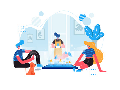

The answer is: it’s a trick question. All of these are by multiple different illustrators for different companies. It’s visually nice and I honestly like how it looks, but it serves no purpose and says nothing. You cannot look at any one of them and name the illustrator who made it, and that’s by design. This art style is the result of a voiceless committee. Need something easily rendered and scalable, check. Anyone can put themselves in it and has few recognizable features that could lend themselves to being a part of a group or identity the viewer isn’t a part of; give em’ inhumanly colored skin, simple faces, and blobby proportions anyone could have, check. Have it be simple so any artist anywhere with at least 3 months experience in Adobe Illustrator could make it, check. It is the safest thing humanly imaginable, and that’s to it’s fault. You cannot look at any of these images and remember them in a week if you were told to, and even if you could you couldn’t associate it with any name or company. This should be awful for companies to do, why are they all doing it? It is awful, but it’s the result of cost evaluation.
The problem that most brands face in the modern age is just how big they are. If you own a platform comprising hundreds of thousands of people, you cannot be represented by an individual. People are volatile and can say things that aren’t representative of the group, it’s a risk. Individualism is the highest risk highest reward game you can play, but to me, the award is worth the risk of alienation. You could get a designer on your company or an illustrator who’s an incredible oil painter and have them breathe life and give your company a voice, but what happens when they do something that’s against the politics of your company and the face you want to project. The harsh truth is that is what the images above come to solve, they have no person behind them, if the illustrator ever became problematic they could simply fire them and replace them with someone else who does the exact same thing in the exact same way. The majority of people would struggle to name a great commercial illustrator of our time, the same cant be said about commercial illustration from the 1880s to the 1950s. Many artists can easily recognize names such as Norman Rockwell, J. C. Leyendecker, N.C. Wyeth, Howard Pyle, Walter Crane, and Arthur Rackham. Norman Rockwell’s art had mass appeal and could relate to the people of his time while also being something only he could do, he’s one of the greatest artists to ever live and his name became synonymous with The Saturday Evening Post magazine over nearly five decades. It takes skill to do what he did. His work and many of the other illustrator’s works I mentioned represents the people of the time, it’s a bold statement of exceptionalism and the greatness of humanity. All that modern illustration says about us culturally is mediocrity and disposability.